Sunday, 18 February 2007

Stereohype badges

Another mention for the Stereohype badge competition, this time in Computer Arts magazine.


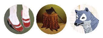
My name isn't mentioned here, but my badges were Third prize in the 'set of three' category. Here they are.

Photobucket - Video and Image Hosting

These are available to purchase from the good folks at Stereohype

Saturday, 17 February 2007

Michel Gondry - The Science of Sleep

Just been to see Michel Gondry's new film, 'The Science of Sleep' and it was just as crazy and fantastic as I suspected it would be. The wonky animation is wonderful!
There's a good resource for all things Gondry over at director file.

Friday, 16 February 2007

letterpress business cards

Hallo again,

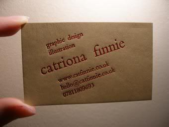
I was out at the printing studio again last night and finally made some progress on my business cards. Having satisfied myself with the design, I printed lots - but now I want to change bits again! This most probably isn't the final design.

Photobucket - Video and Image Hosting
This one is the design I printed most of, and the one I would probably use.

Photobucket - Video and Image Hosting
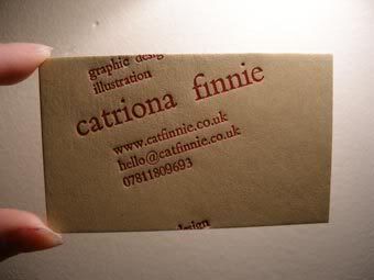
This one is a bit quirkier... I had to print on the card twice to make the word "design" appear as if it was edging off the top of the card and re-appearing at the bottom.

In case you're interested, my name is printed in Bembo 30 point, with everything else in Bembo 12 point type.

Wednesday, 14 February 2007

more valentine's prints

Photobucket Album

new prints with the Gocco

Hallo,

It's been a while since my last Gocco related post and I've been just got around to finally giving it a whirl.
For any would-be-Gocco-users I'd just like to say that I found the tutorial over at the Small Object very helpful as the images in the manual aren't very clear, and if you are without a manual then the tutorial is essential reading.

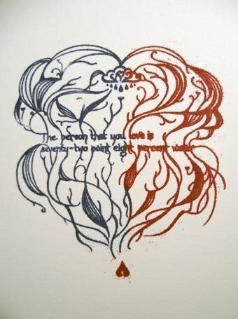
Anyways, here's a peek at my first attempt. I think it will take a few experiments to really get the hang of what can be done. I noticed that the colour of ink you choose seems to make a difference to how much is needed/ how quickly it dries(possibly the consistancy is slightly varied from one to the next).

Photobucket - Video and Image Hosting

It says "the person that you love is seventy-two point eight percent water" in case you were wondering. Just a quote that I found in Alan Fletcher's book 'The Art of Looking Sideways." It was also slightly relevant because of it being St Valentine's day.
Happy Valentines.

Monday, 12 February 2007

the art of Graphic Besign

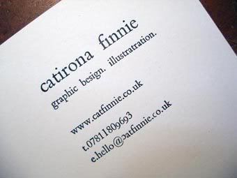
Here's my most recent product of the printing press - it was supposed to be my details as I might have them on my business cards but, if I use it as it is, I shall have to change my proffession to that of graphic besign, or perhaps become an illustratrator?

Photobucket - Video and Image Hosting

It would have been nice to have at least spelled my name right. But why quibble with such matters when the quality of the letterpress ink on paper is so pretty?

I said it was a tricky business, and I'll say it again. So there!

Monday, 5 February 2007

alphabetti spaghetti

Just thinking about letterpress again, and how it really makes you think about the shapes of each individual letter. Thought I'd share a couple of things I've found about letters, from people who inspire me:-

1. A quote from the book 'Like' by Ali Smith:

"It's funny how the letters that make up words can look like people... In this book the small a's look sort of like small nice people with fat stomachs. The other way of doing a's, the round way, makes them look like they have long faces... Some e's can look smiley but usually they look like they do here, mean, like they're laughing at something horrible. Small d's look like they're wide awake. Small g's like they're holding out a hand to shake it, or if they have loops underneath, like they're looking at you with their mouths open."

2. An illustration by Sara Fanelli (www.sarafanelli.com)