ABC3D
3D alphabet book by Marion Bataille.
Some new work from ever my favourite Marian Bantjes... type so pretty I could eat it with a spoon...
And this by Non-Format...
A couple of nice videos here from Jonas and Francois.
Nice hand-lettering in the Good Life video (above)

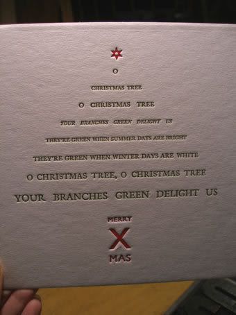
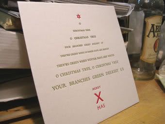
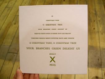
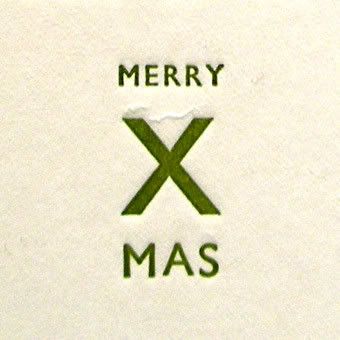
Here they are then, fresh from the letterpress - my finished xmas cards, ready for December!
Printed on beermat board to get a nice deep impression off the letters (yes I know it's not supposed to make an impression but it looks nice!)
I have an idea to punch a hole in one of these around xmas and string some ribbon through to hang on the tree. I think that'd look pretty good.
A much more triangular tree shape!
Still looks a bit like an arrow... I think next week I will set the "merry xmas" in a separate block so that I can print it in a different colour. Might even add a star in too!
Been printing them on some nice biodegradable 'beermat' material ...at last! - A xmas card you can use to catch drink spillages after the season of festive cheer is over. Now that's what everyone needs for xmas.
Hallo,
So, this week at letterpress I thought I'd have a go at something useful... last week's attempt went a bit awry, hence the 'type faces' post, where I recycled my type into characters.
Anyway, since I'm generally terrible at remembering to go and buy xmas cards let alone send them, I thought I'd start reaaaaally early and make some nice letterpress ones.
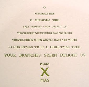
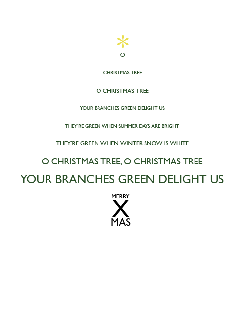
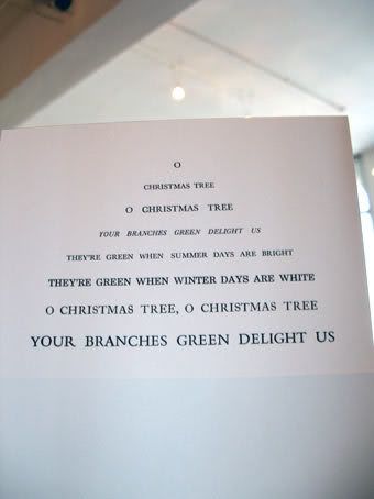
I came up with a quick concept to set a translation of 'O Tannenbaum' in the shape of a Christmas tree, and did a quick version in Illustrator to try and figure out roughly the proportional sizes I'd have to use to make the lines form a good Christmas tree shape.
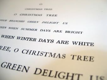
That done, it was off to letterpress, where nothing is ever straightforward. Some muddling about with word spacing and type sizes later, and here is the result.
Sort of a Christmas tree :P
So, next week there will be some fun with letter-spacing and setting the 'trunk' and hopefully some green ink, and when all that is done I'm hoping to set some random 'O's and a star in a different colour and print over the top.
Watch this space.
This week I have been mostly aquainting myself with the work of
Jo Ratcliffe
...and also Marian Bantjes
There is an interesting interview with Marian Bantjes on Veer as part of their "portraits of creativity". You can read the full interview here
Bantjes on creative blocks: "When I have no ideas, I usually just suffer and cry. I go for walks, I take a bath, I go to sleep. I’m frequently lucky enough to wake up in the morning with the idea."
It's good to know that someone who makes such extraordinary work gets stuck sometimes too.
Just thinking about letterpress again, and how it really makes you think about the shapes of each individual letter. Thought I'd share a couple of things I've found about letters, from people who inspire me:-
1. A quote from the book 'Like' by Ali Smith:
"It's funny how the letters that make up words can look like people... In this book the small a's look sort of like small nice people with fat stomachs. The other way of doing a's, the round way, makes them look like they have long faces... Some e's can look smiley but usually they look like they do here, mean, like they're laughing at something horrible. Small d's look like they're wide awake. Small g's like they're holding out a hand to shake it, or if they have loops underneath, like they're looking at you with their mouths open."
2. An illustration by Sara Fanelli (www.sarafanelli.com)